

Weathered Set
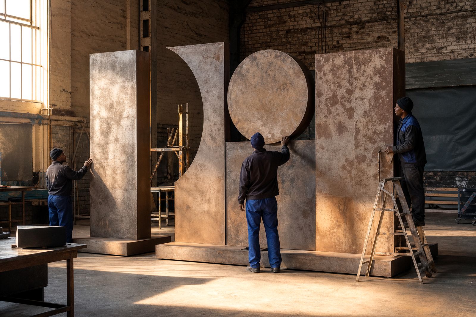
Distressed finish with intention
Distressed finishes are created by purposefully applying wear, fading, or aged effects to letters or branded pieces. These techniques are chosen to evoke a specific vintage or industrial look that suits the event’s concept and setting.
Shape, placement and the level of ageing detail all influence how the final set appears. Timber tones, oxidised effects, faded paint layers and edge wear all need to match the event palette, lighting and viewing distance.
Clear descriptions matter on this style because one team's 'vintage' can be another team's 'too damaged'. Close inspection of the sample finish helps lock the look before full production starts. Crews then have a finish target to check against when letters are wrapped, transported and positioned on site.
Key features of a weathered finish
A weathered set needs more than a colour callout. We note the base material, paint build-up, exposed underlayers, rubbed edges and any printed or cut branding that must still stay legible after distressing. Scale is important too, because subtle ageing can disappear on large pieces unless the finish is built for long-view impact.
Each face needs to be checked against the others so the set stays visually consistent. Distress marks should never obscure logos, names or sponsor artwork, especially on hero letters that will appear in photos. A weathered finish is built from two features:
- Layered paint effects with controlled wear
- Edge distress checked in venue lighting
Barns, estates and factory spaces
Barn venues, estates, factories and urban event spaces each carry weathered finishes differently. Branding for shopping centres often needs to appear distressed up close but still remain legible from a distance.
Scratches, scuffs or shifts in the weathered effect can occur during loading, transport and setup. Inspection on arrival at the client’s venue helps confirm that the intended level of distress is unchanged, and any dust or residue can be removed before the event begins.
Briefing a weathered finish
Florals, staging, neon or printed backdrops that will be near the piece should be mentioned in the brief to refine the finish. Word or brand name, intended size, venue type and finish references should all be provided at the start. Requests for reclaimed timber character, faded painted metal cues, or a softer rubbed-back look help guide the process.
Artwork and distress pattern approval comes from a clear description of corners, edges and face texture. These reference notes stay with the event file so future builds can match the original finish as closely as possible.
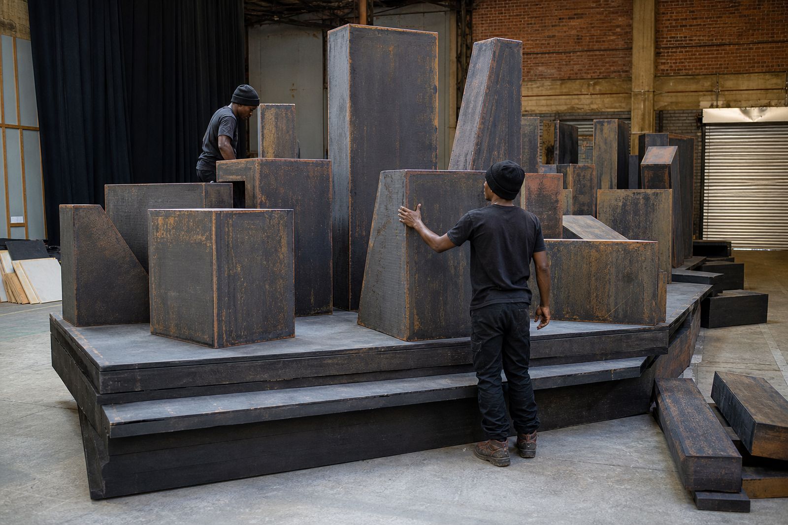
What our Sign Lettering customers say
Verified Google reviews
Tell us about your venue and wording
Send the wording, the venue and the date, and we will come back with practical letter options, materials and an install plan.
Start your brief